
Dimensionality Reduction
Manifold learning is an approach to non-linear dimensionality reduction. Algorithms for this task are based on the idea that the dimensionality of many data sets is only artificially high.
High-dimensional datasets can be very difficult to visualize. While data in two or three dimensions can be plotted to show the inherent structure of the data, equivalent high-dimensional plots are much less intuitive. To aid visualization of the structure of a dataset, the dimension must be reduced in some way.
The simplest way to accomplish this dimensionality reduction is by taking a random projection of the data. Though this allows some degree of visualization of the data structure, the randomness of the choice leaves much to be desired. In a random projection, it is likely that the more interesting structure within the data will be lost.
To address this concern, a number of supervised and unsupervised linear dimensionality reduction frameworks have been designed, such as:
- Principal Component Analysis (PCA)
- Locally Linear Embedding (LLE)
- tStochastic Neighbor Embedding (t-SNE)
- Multidimensional Scaling (MDS)
- Isometric Mapping (ISOMAP)
- Fisher Linear Discriminant Analysis (LDA)
Dataset
A multivariate study of variation in two species of rock crab of genus Leptograpsus: A multivariate approach has been used to study morphological variation in the blue and orange-form species of rock crab of the genus Leptograpsus. Objective criteria for the identification of the two species are established, based on the following characters:
- SP: Species (Blue or Orange)
- Sex: Male or Female
- FL: Width of the frontal region of the carapace;
- RW: Width of the posterior region of the carapace (rear width);
- CL: Length of the carapace along the midline;
- CW: Maximum width of the carapace;
- BD: and the depth of the body;
The dataset can be downloaded from Github:
pd.set_option('display.precision', 3)
leptograpsus_data = pd.read_csv('data/A_multivariate_study_of_variation_in_two_species_of_rock_crab_of_genus_Leptograpsus.csv')
leptograpsus_data.head()
| sp | sex | index | FL | RW | CL | CW | BD | |
|---|---|---|---|---|---|---|---|---|
| 0 | B | M | 1 | 8.1 | 6.7 | 16.1 | 19.0 | 7.0 |
| 1 | B | M | 2 | 8.8 | 7.7 | 18.1 | 20.8 | 7.4 |
| 2 | B | M | 3 | 9.2 | 7.8 | 19.0 | 22.4 | 7.7 |
| 3 | B | M | 4 | 9.6 | 7.9 | 20.1 | 23.1 | 8.2 |
| 4 | B | M | 5 | 9.8 | 8.0 | 20.3 | 23.0 | 8.2 |
Preprocessing
data = leptograpsus_data.rename(columns={
    'sp': 'species',
    'FL': 'Frontal Lobe',
    'RW': 'Rear Width',
    'CL': 'Carapace Midline',
    'CW': 'Maximum Width',
    'BD': 'Body Depth'})

data['species'] = data['species'].map({'B':'Blue', 'O':'Orange'})
data['sex'] = data['sex'].map({'M':'Male', 'F':'Female'})

data.head()
| species | sex | index | Frontal Lobe | Rear Width | Carapace Midline | Maximum Width | Body Depth | |
|---|---|---|---|---|---|---|---|---|
| 0 | Blue | Male | 1 | 8.1 | 6.7 | 16.1 | 19.0 | 7.0 |
| 1 | Blue | Male | 2 | 8.8 | 7.7 | 18.1 | 20.8 | 7.4 |
| 2 | Blue | Male | 3 | 9.2 | 7.8 | 19.0 | 22.4 | 7.7 |
| 3 | Blue | Male | 4 | 9.6 | 7.9 | 20.1 | 23.1 | 8.2 |
| 4 | Blue | Male | 5 | 9.8 | 8.0 | 20.3 | 23.0 | 8.2 |
data.shape
# (200, 8)

data_columns = ['Frontal Lobe',
                'Rear Width',
                'Carapace Midline',
                'Maximum Width',
                'Body Depth']

data[data_columns].describe()
| Frontal Lobe | Rear Width | Carapace Midline | Maximum Width | Body Depth |
|---|---|---|---|---|
| 200.000 | 200.000 | 200.000 | 200.000 | 200.000 |
| 25.500 | 15.583 | 12.800 | 32.100 | 36.800 |
| 14.467 | 3.495 | 2.573 | 7.119 | 7.872 |
| 1.000 | 7.200 | 6.500 | 14.700 | 17.100 |
| 13.000 | 12.900 | 11.000 | 27.275 | 31.500 |
| 25.500 | 15.550 | 12.800 | 32.100 | 36.800 |
| 38.000 | 18.050 | 14.300 | 37.225 | 42.000 |
| 50.000 | 23.100 | 20.200 | 47.600 | 54.600 |
The dataset now needs to be segmented into 4 Classes for sex (male, female) and species (blue, orange). We can add this identifier as an additional row to our dataset inform of a concatenate value from the species and sex feature:
data['class'] = data.species + data.sex
data['class'].value_counts()
The entire dataset has a size of 200 and each class is equally represented with 50 specimens:
- BlueMale : 50
- BlueFemale : 50
- OrangeMale : 50
- OrangeFemale : 50
Name: class, dtype: int64
Visualization
Boxplots
# plot features vs classes
fig, axes = plt.subplots(nrows=3, ncols=2, figsize=(18,18))
data[data_columns].boxplot(ax=axes[0,0])
data.boxplot(column='Frontal Lobe', by='class', ax=axes[0,1])
data.boxplot(column='Rear Width', by = 'class', ax=axes[1,0])
data.boxplot(column='Carapace Midline', by='class', ax=axes[1,1])
data.boxplot(column='Maximum Width', by = 'class', ax=axes[2,0])
data.boxplot(column='Body Depth', by = 'class', ax=axes[2,1])
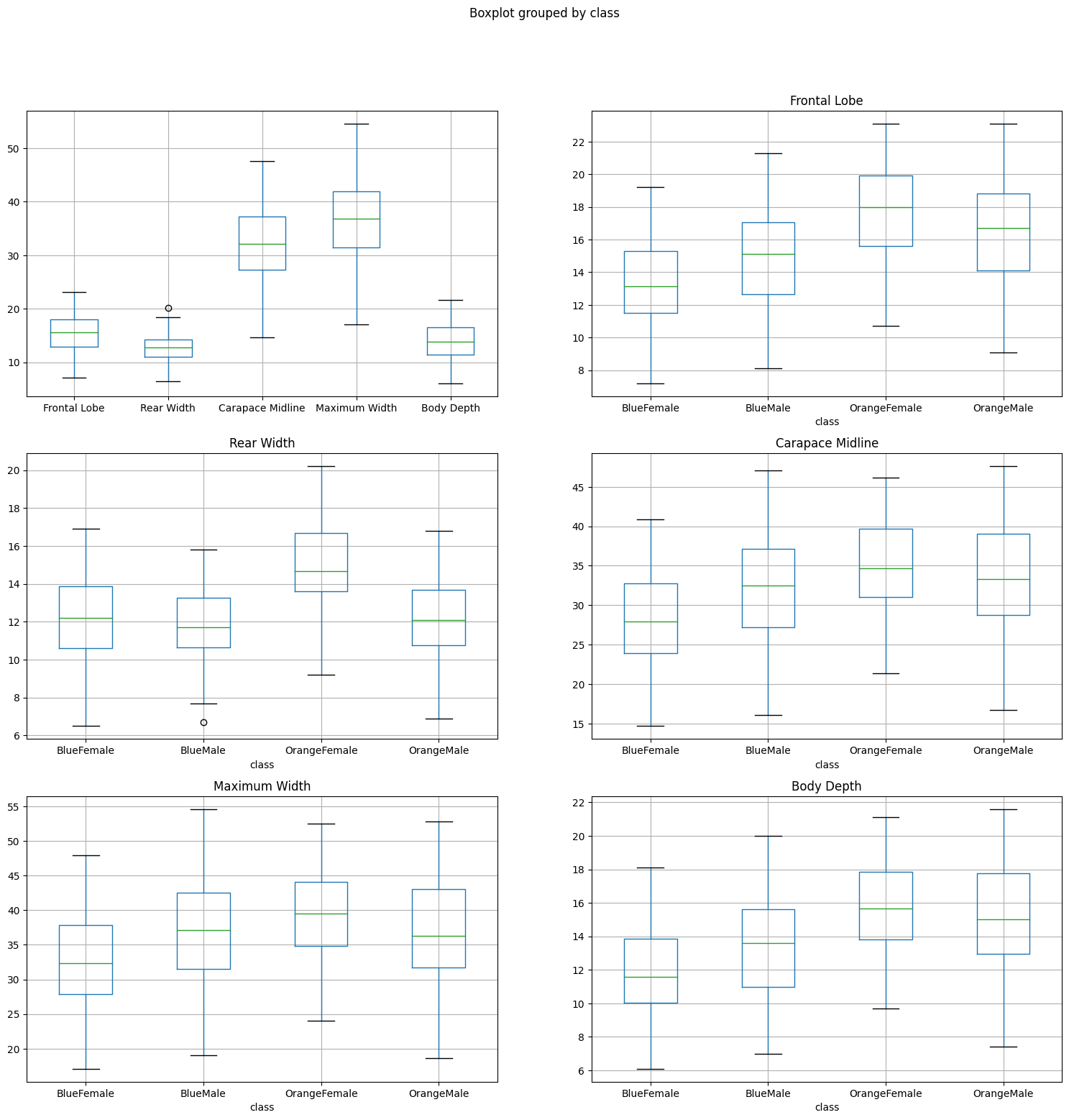
While the orange and blue female show a good separation in several features the male counterparts are very close together. The Body Depth and Frontal Lobe dimensions are the best features to differentiate both species in the male sub class.
Histograms
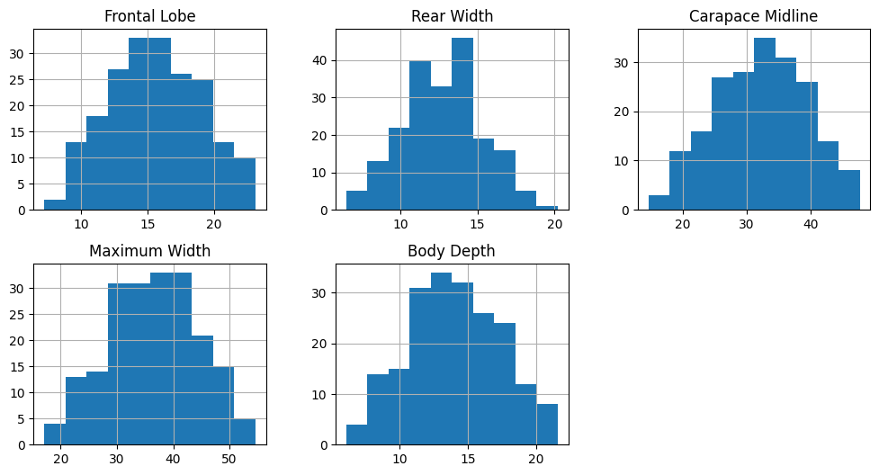
data[data_columns].hist(figsize=(12,6), layout=(2,3))
fig, axes = plt.subplots(nrows=5, ncols=1, figsize=(10,20))
sns.histplot(data, x='Frontal Lobe', hue='class', kde=True, element='step', bins=20, ax=axes[0])
sns.histplot(data, x='Rear Width', hue='class', kde=True, element='step', bins=20, ax=axes[1])
sns.histplot(data, x='Carapace Midline', hue='class', kde=True, element='step', bins=20, ax=axes[2])
sns.histplot(data, x='Maximum Width', hue='class', kde=True, element='step', bins=20, ax=axes[3])
sns.histplot(data, x='Body Depth', hue='class', kde=True, element='step', bins=20, ax=axes[4])
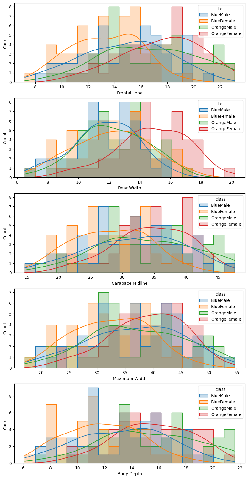
Again, the orange and blue coloured distributions - representing the females of the orange and blue species - are well seperated. But there is a large overlap between the male counterparts. We can see that while the boxplot still showed a visible difference in the Frontal Lobe and Body Depth mean value, it is much harder to differentiate the histrograms.
Pairplot
sns.pairplot(data, hue='class')
# sns.pairplot(data, hue='class', diag_kind="hist")
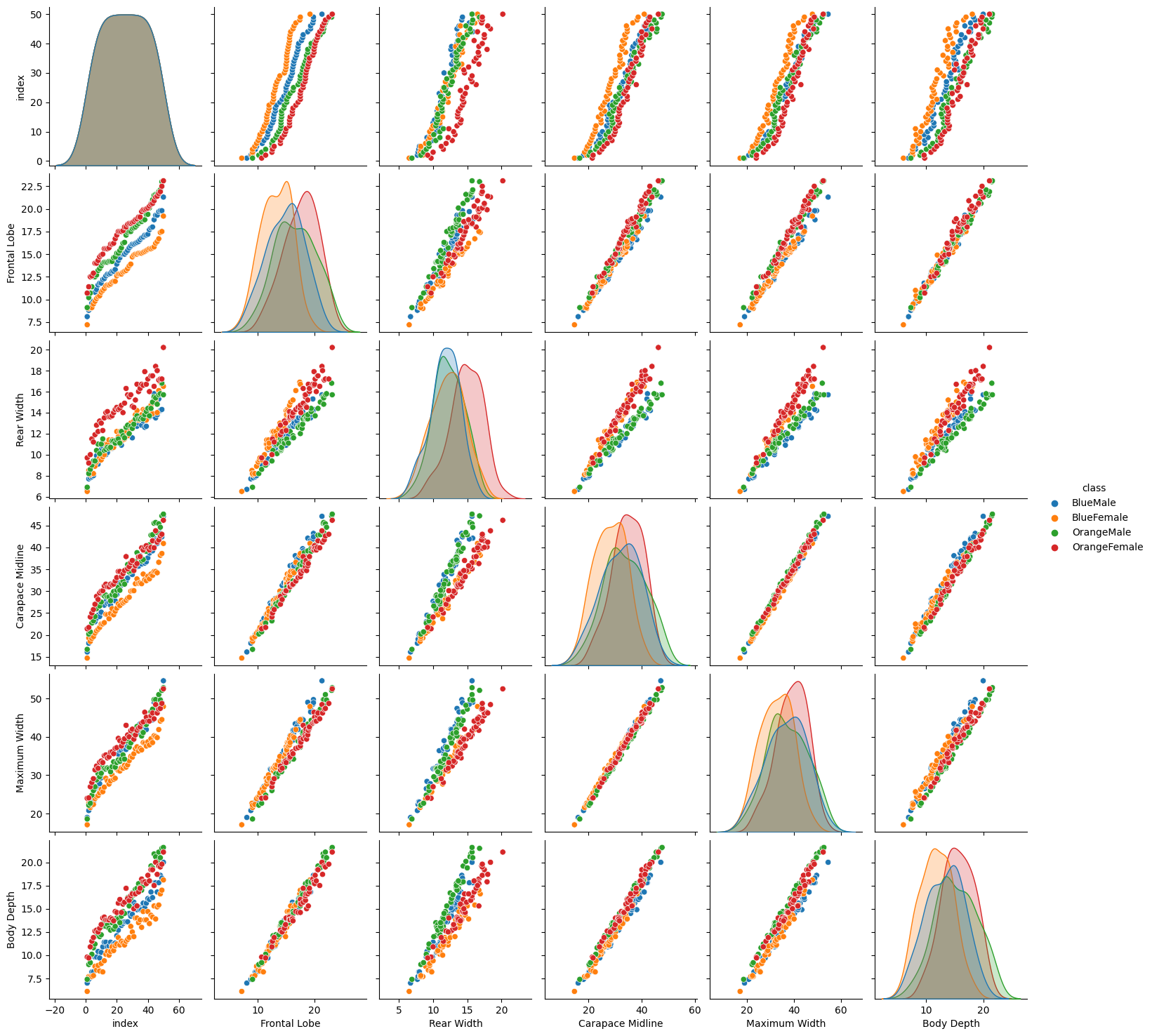
The pairplot plots the relationships of each pair of features. We can see that there are several plots that separate between our female and male classes. For example the Rear Width separates the green/blue (male) dots from the orange/red (female) ones. There is some separation between both female species (red/orange dots) in the Frontal Lobe and Body Depth graphs. But again, it is hard to separate both male species - there is always a strong overlap between the blue and green dots.
Principal Component Analaysis
A PCA is a reduction technique that transforms a high-dimensional data set into a new lower-dimensional data set. At the same time, preserving the maximum amount of information from the original data.
# Normalize data columns before applying PCA
data_norm = data.copy()
data_norm[data_columns] = StandardScaler().fit_transform(data[data_columns])
data_norm.describe().T
Normalization sets the mean of all data columns to ~0 and the standard deviation to ~1:
| count | mean | std | min | 25% | 50% | 75% | max | |
|---|---|---|---|---|---|---|---|---|
| index | 200.0 | 2.550e+01 | 14.467 | 1.000 | 13.000 | 2.550e+01 | 38.000 | 50.000 |
| Frontal Lobe | 200.0 | -7.105e-17 | 1.003 | -2.404 | -0.770 | -9.465e-03 | 0.708 | 2.156 |
| Rear Width | 200.0 | 6.040e-16 | 1.003 | -2.430 | -0.677 | 2.396e-02 | 0.608 | 2.907 |
| Carapace Midline | 200.0 | 1.066e-16 | 1.003 | -2.451 | -0.680 | -7.745e-04 | 0.721 | 2.182 |
| Maximum Width | 200.0 | -4.974e-16 | 1.003 | -2.460 | -0.626 | 4.909e-02 | 0.711 | 2.316 |
| Body Depth | 200.0 | 0.000e+00 | 1.003 | -2.321 | -0.770 | -3.820e-02 | 0.752 | 2.216 |
# number of classes = 5
no_components = 5
principal = PCA(n_components = no_components)
principal.fit(data_norm[data_columns])

data_transformed=principal.transform(data_norm[data_columns])
print(data_transformed.shape)
# (200, 5)

singular_values = principal.singular_values_
variance_ratio = principal.explained_variance_ratio_
# show variance vector for each dimension
print(variance_ratio)
print(variance_ratio.cumsum())
print(singular_values)
| Frontal Lobe | Rear Width | Carapace Midline | Maximum Width | Body Depth | |
|---|---|---|---|---|---|
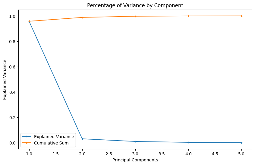
| Explained Variance | 9.57766957e-01 | 3.03370413e-02 | 9.32659482e-03 | 2.22707143e-03 | 3.42335531e-04 |
| Cumulative Sum | 0.95776696 | 0.988104 | 0.99743059 | 0.99965766 | 1. |
| Singular Values | 30.94781021 | 5.50790717 | 3.05394742 | 1.49233757 | 0.58509446 |
Adding variables to our model can increase our models performance if the added variable adds explanatory power. Too many variables, especially non-correlating or noisy dimensions, can lead to overfitting. As seen above, already using 2 (98.8%) or 3 (99.7%) of our 5 classes allows us to describe our dataset with a high accuracy - the additional 2 will not add much value.
Scree Plot
A Scree plot is a graph useful to plot the eigenvectors. This plot is useful to determine the PCA. It orders the values in descending order that is from largest to smallest. It allows us to determine the number of Principal Component is a graphical representation by visualizing the amount of variation a value adds to a given dataset.
fig = plt.figure(figsize=(10, 6))
plt.plot(range(1, (no_components+1)), singular_values, marker='.')
y_label = plt.ylabel('Singular Values')
x_label = plt.xlabel('Principal Components')
plt.title('Scree Plot')
According to the scree test, the "elbow" of the graph where the eigenvalues seem to level off is found and factors or components to the left of this point should be retained as significant - here this would be the first two or three classes:
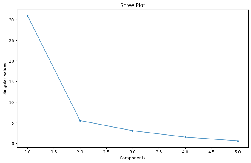
fig = plt.figure(figsize=(10, 6))

plt.plot(range(1, (no_components+1)), variance_ratio, marker='.', label='Explained Variance')
plt.plot(range(1, (no_components+1)), variance_ratio.cumsum(), marker='.', label='Cumulative Sum')

y_label = plt.ylabel('Explained Variance')
x_label = plt.xlabel('Principal Components')
plt.title('Percentage of Variance by Component')
plt.legend()
The values of the amount of variance a component brings to our dataset and it's cumulative sum shows the same 'elbow' to pick our principal components from:
Component PCA Weights
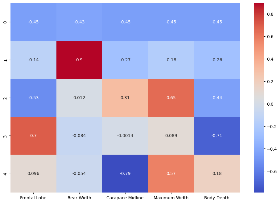
Our Principal Component Analysis assigned weights to each component allowing us to discard components that do not help us to classify the species in our dataset. Those weights can be visualized in a heatmap:
fig = plt.figure(figsize=(12, 8))
sns.heatmap(
    principal.components_,
    cmap='coolwarm',
    xticklabels=list(data.columns[3:-1]),
    annot=True)
Transformation and Visualization
# use 3 principal components out of the 5 components
print(data_transformed[:,:3])

# append the 3 principal components to the norm dataframe
data_norm[['PC1', 'PC2', 'PC3']] = data_transformed[:,:3]

data_norm.head()
| species | sex | index | Frontal Lobe | Rear Width | Carapace Midline | Maximum Width | Body Depth | class | PC1 | PC2 | PC3 | |
|---|---|---|---|---|---|---|---|---|---|---|---|---|
| 0 | Blue | Male | 1 | -2.146 | -2.352 | -2.254 | -2.218 | -2.058 | BlueMale | 4.928 | -0.268 | -0.122 |
| 1 | Blue | Male | 2 | -1.945 | -1.963 | -1.972 | -1.989 | -1.941 | BlueMale | 4.386 | -0.094 | -0.039 |
| 2 | Blue | Male | 3 | -1.831 | -1.924 | -1.846 | -1.785 | -1.853 | BlueMale | 4.129 | -0.169 | 0.034 |
| 3 | Blue | Male | 4 | -1.716 | -1.885 | -1.691 | -1.696 | -1.707 | BlueMale | 3.884 | -0.246 | 0.015 |
| 4 | Blue | Male | 5 | -1.659 | -1.846 | -1.662 | -1.708 | -1.707 | BlueMale | 3.834 | -0.224 | -0.015 |
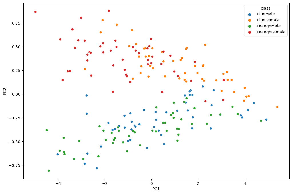
2D Plot
fig = plt.figure(figsize=(12, 8))
_ = sns.scatterplot(x='PC1', y='PC2', hue='class', data=data_norm)
3D Plot
class_colours = {
    'BlueMale': '#0027c4', #blue
    'BlueFemale': '#f18b0a', #orange
    'OrangeMale': '#0af10a', # green
    'OrangeFemale': '#ff1500', #red
}

colours = data['class'].apply(lambda x: class_colours[x])

x=data_norm.PC1
y=data_norm.PC2
z=data_norm.PC3

fig = plt.figure(figsize=(10,10))
ax = fig.add_subplot(projection='3d')

ax.scatter(xs=x, ys=y, zs=z, s=50, c=colours)
plot = px.scatter_3d(
    data_norm,
    x = 'PC1',
    y = 'PC2',
    z='PC3',
    color='class')

plot.show()
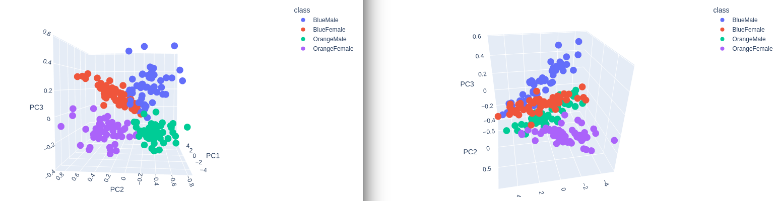
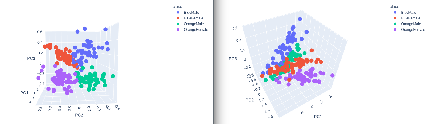
Separation! Nice :)