Seaborn Cheat Sheet 2023
- Seaborn Cheat Sheet 2023
import numpy  as np
import pandas as pd
import matplotlib.pyplot as plt
import seaborn as sns
Datasets
Office Sales
!wget https://raw.githubusercontent.com/ashok-python/data/master/dm_office_sales.csv -P datasets
office_sales_df = pd.read_csv('datasets/dm_office_sales.csv')
office_sales_df.head(3)
| division | level of education | training level | work experience | salary | sales | |
|---|---|---|---|---|---|---|
| 0 | printers | some college | 2 | 6 | 91684 | 372302 |
| 1 | printers | associate's degree | 2 | 10 | 119679 | 495660 |
| 2 | peripherals | high school | 0 | 9 | 82045 | 320453 |
Student Performance
!wget https://raw.githubusercontent.com/rashida048/Datasets/master/StudentsPerformance.csv -P datasets
students_performance_df = pd.read_csv('datasets/StudentsPerformance.csv')
students_performance_df.head(3)
| gender | race/ethnicity | parental level of education | lunch | test preparation course | math score | reading score | writing score | |
|---|---|---|---|---|---|---|---|---|
| 0 | female | group B | bachelor's degree | standard | none | 72 | 72 | 74 |
| 1 | female | group C | some college | standard | completed | 69 | 90 | 88 |
| 2 | female | group B | master's degree | standard | none | 90 | 95 | 93 |
Toronto Weather
!wget https://github.com/datagy/mediumdata/raw/master/toronto-weather.xlsx -P datasets
cols = ['LOCAL_DATE', 'MEAN_TEMPERATURE']
renames = {'LOCAL_DATE': 'Date', 'MEAN_TEMPERATURE': 'Temperature'}

country_table_df = pd.read_excel('datasets/toronto-weather.xlsx', usecols=cols, parse_dates=['LOCAL_DATE'])
country_table_df.rename(columns=renames, inplace=True)
country_table_df['Day'] = country_table_df['Date'].dt.day
country_table_df['Month'] = country_table_df['Date'].dt.month
country_table_df = country_table_df[country_table_df['Day'] <= 28]

country_table_df = pd.pivot_table(
    data=country_table_df,
    index='Month',
    columns='Day',
    values='Temperature'
)

country_table_df.iloc[:3, :3]
Credit Card Approval Prediction
!wget https://raw.githubusercontent.com/BrunoHerick/analiseCartaoCredito/main/application_record.csv -P datasets
credit_approv_df = pd.read_csv('datasets/application_record.csv')
credit_approv_df.head(3).transpose()
| 0 | 1 | 2 | |
|---|---|---|---|
| ID | 5008804 | 5008805 | 5008806 |
| CODE_GENDER | M | M | M |
| FLAG_OWN_CAR | Y | Y | Y |
| FLAG_OWN_REALTY | Y | Y | Y |
| CNT_CHILDREN | 0 | 0 | 0 |
| AMT_INCOME_TOTAL | 427500.0 | 427500.0 | 112500.0 |
| NAME_INCOME_TYPE | Working | Working | Working |
| NAME_EDUCATION_TYPE | Higher education | Higher education | Secondary / secondary special |
| NAME_FAMILY_STATUS | Civil marriage | Civil marriage | Married |
| NAME_HOUSING_TYPE | Rented apartment | Rented apartment | House / apartment |
| DAYS_BIRTH | -12005 | -12005 | -21474 |
| DAYS_EMPLOYED | -4542 | -4542 | -1134 |
| FLAG_MOBIL | 1 | 1 | 1 |
| FLAG_WORK_PHONE | 1 | 1 | 0 |
| FLAG_PHONE | 0 | 0 | 0 |
| FLAG_EMAIL | 0 | 0 | 0 |
| OCCUPATION_TYPE | NaN | NaN | Security staff |
| CNT_FAM_MEMBERS | 2 | 2 | 2 |
| CLASSIFICAO | bom | bom | bom |
Tips
!wget https://raw.githubusercontent.com/plotly/datasets/master/tips.csv -P datasets
tips_df = pd.read_csv('datasets/tips.csv')
tips_df.head(3).transpose()
| 0 | 1 | 2 | |
|---|---|---|---|
| total_bill | 16.99 | 10.34 | 21.01 |
| tip | 1.01 | 1.66 | 3.5 |
| sex | Female | Male | Male |
| smoker | No | No | No |
| day | Sun | Sun | Sun |
| time | Dinner | Dinner | Dinner |
| size | 2 | 3 | 3 |
Scatter Plots
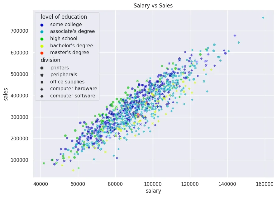
plt.figure(figsize=(10, 7))

sns.set(style='darkgrid')

# hue/style by categorical column
sns.scatterplot(
    x='salary',
    y='sales',
    data=office_sales_df,
    s=40,
    alpha=0.6,
    hue='level of education',
    palette='nipy_spectral',
    style='division'
).set_title('Salary vs Sales')

plt.savefig('assets/Seaborn_Cheat_Sheet_01.webp', bbox_inches='tight')
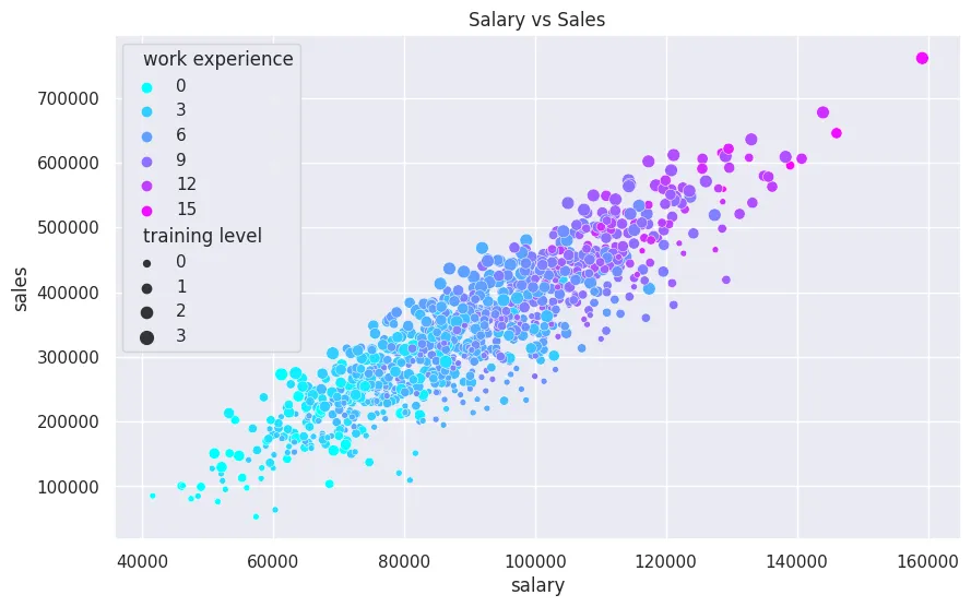
plt.figure(figsize=(10, 6))

# hue/size by continuous column
sns.scatterplot(
    x='salary',
    y='sales',
    data=office_sales_df,
    hue='work experience',
    palette='cool',
    size='training level'
).set_title('Salary vs Sales')

plt.savefig('assets/Seaborn_Cheat_Sheet_02.webp', bbox_inches='tight')
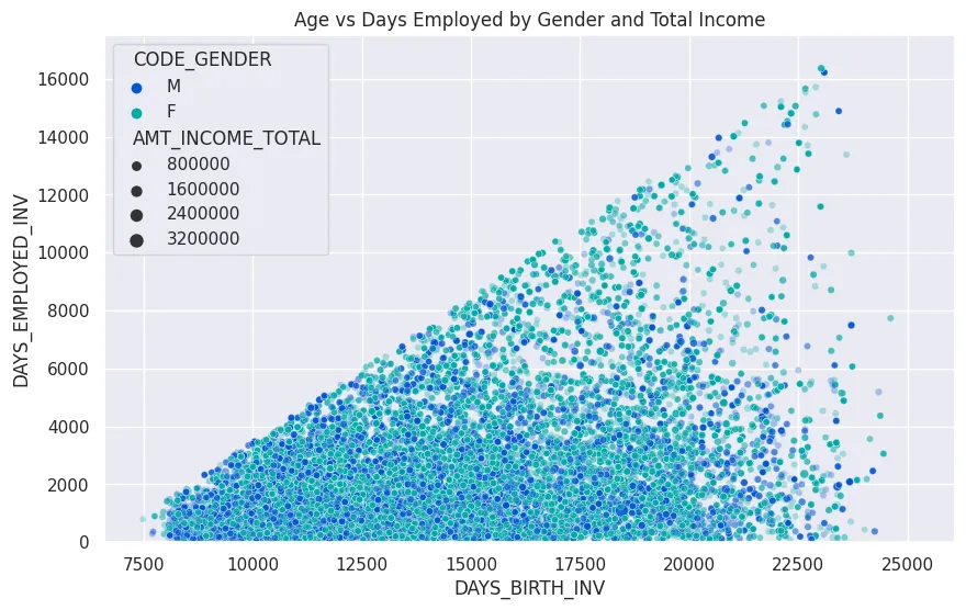
plt.figure(figsize=(10, 6))

credit_approv_df['DAYS_BIRTH_INV'] = credit_approv_df['DAYS_BIRTH'].apply(lambda num: num*(-1))
credit_approv_df['DAYS_EMPLOYED_INV'] = credit_approv_df['DAYS_EMPLOYED'].apply(lambda num: num*(-1))

# hue/size by continuous column
plot = sns.scatterplot(
    x='DAYS_BIRTH_INV',
    y='DAYS_EMPLOYED_INV',
    data=credit_approv_df,
    hue='CODE_GENDER',
    palette='winter',
    size='AMT_INCOME_TOTAL',
    alpha=0.3
)

plot.set_title('Age vs Days Employed by Gender and Total Income')
plot.set_ylim(0, 17500)

plt.savefig('assets/Seaborn_Cheat_Sheet_20.webp', bbox_inches='tight')
Continuous Distribution Plots
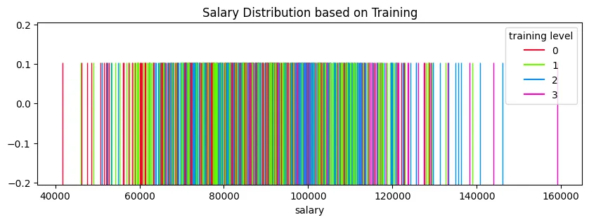
Rug Plot
plt.figure(figsize=(10, 3))
plt.title('Salary Distribution based on Training')

sns.rugplot(
    data=office_sales_df,
    x='salary',
    height=0.75,
    hue='training level',
    palette='gist_rainbow'
)

plt.savefig('assets/Seaborn_Cheat_Sheet_03.webp', bbox_inches='tight')
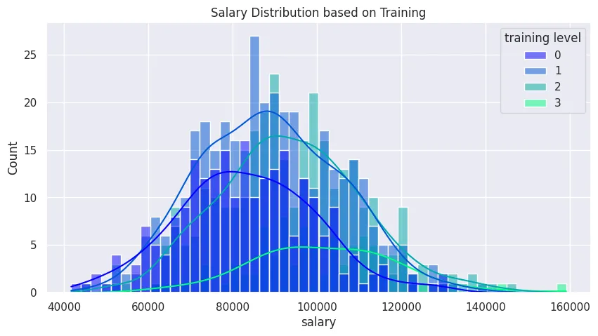
Histogram
plt.figure(figsize=(10, 5))
plt.title('Salary Distribution based on Training')

sns.histplot(
    data=office_sales_df,
    x='salary',
    bins=50,
    hue='training level',
    palette='winter',
    kde=True
)

plt.savefig('assets/Seaborn_Cheat_Sheet_04.webp', bbox_inches='tight')
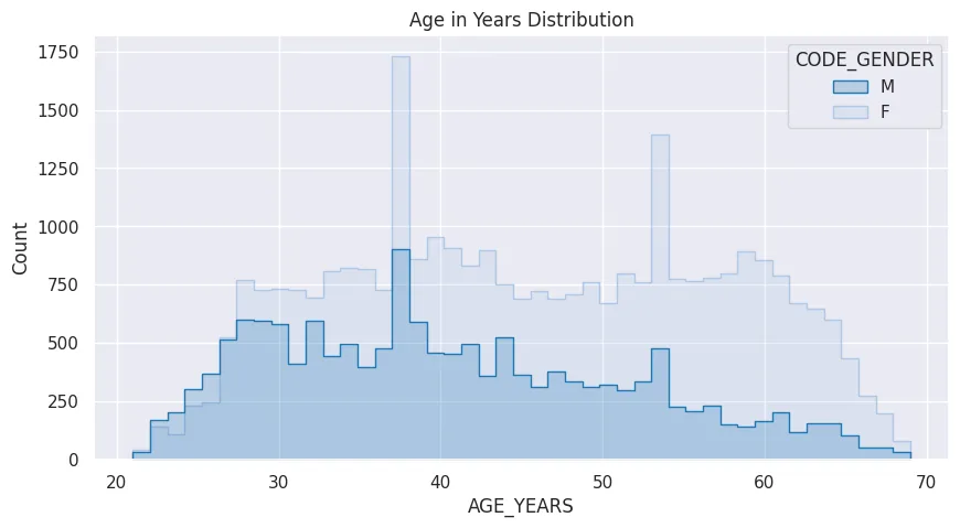
credit_approv_df['AGE_YEARS'] = credit_approv_df['DAYS_BIRTH'].apply(lambda num: round(num/(-365)))

plt.figure(figsize=(10, 5))
plt.title('Age in Years Distribution')

sns.histplot(
    data=credit_approv_df,
    x='AGE_YEARS',
    bins=45,
    element='step',
    hue='CODE_GENDER',
    palette='tab20'
)

plt.savefig('assets/Seaborn_Cheat_Sheet_21.webp', bbox_inches='tight')
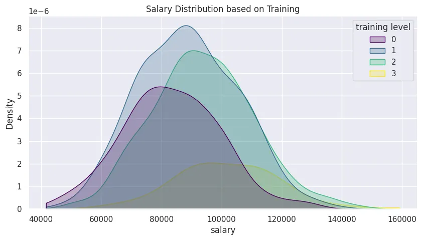
Kernel Density Estimation
plt.figure(figsize=(10, 5))
plt.title('Salary Distribution based on Training')

sns.kdeplot(
    data=office_sales_df,
    clip=[
        office_sales_df['salary'].min(),
        office_sales_df['salary'].max()
    ],
    x='salary',
    hue='training level',
    palette='viridis',
    fill=True
)

plt.savefig('assets/Seaborn_Cheat_Sheet_05.webp', bbox_inches='tight')
Categorical Plots
Count Plot
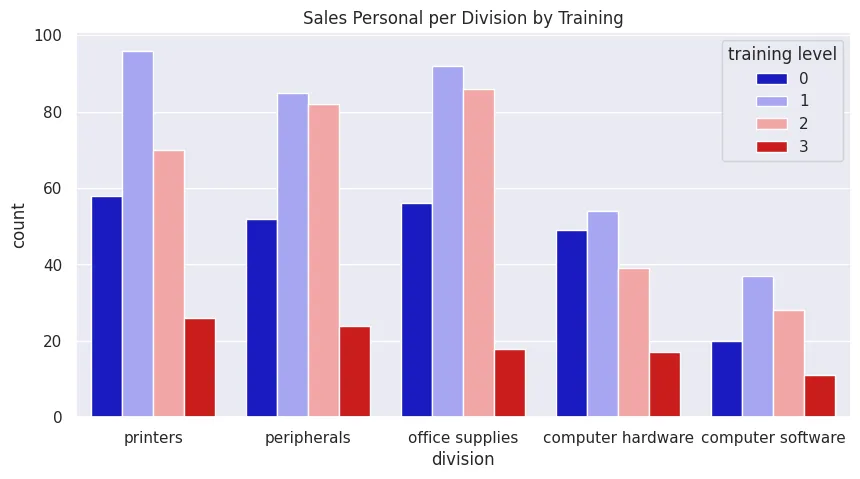
plt.figure(figsize=(10, 5))
plt.title('Sales Personal per Division by Training')

sns.countplot(
    data=office_sales_df,
    x='division',
    hue='training level',
    palette='seismic'
)

plt.savefig('assets/Seaborn_Cheat_Sheet_06.webp', bbox_inches='tight')
Barplot
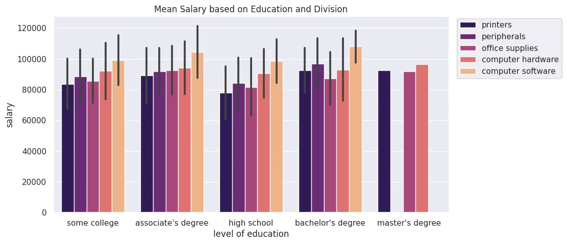
plt.figure(figsize=(10, 5))
plt.title('Mean Salary based on Education and Division')
sns.set(style='darkgrid')
sns.barplot(
    data=office_sales_df,
    x='level of education',
    y='salary',
    estimator=np.mean,
    errorbar='sd',
    hue='division',
    palette='magma'
)
plt.legend(bbox_to_anchor=(1.01,1.01))
plt.savefig('assets/Seaborn_Cheat_Sheet_07.webp', bbox_inches='tight')
Categorical Distribution Plots
Boxplot
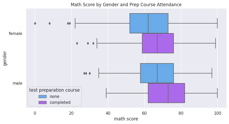
plt.figure(figsize=(10, 5))
plt.title('Math Score by Gender and Prep Course Attendance')

sns.boxplot(
    data=students_performance_df,
    y='gender',
    x='math score',
    hue='test preparation course',
    palette='cool',
    orient='h'
)
plt.savefig('assets/Seaborn_Cheat_Sheet_08.webp', bbox_inches='tight')
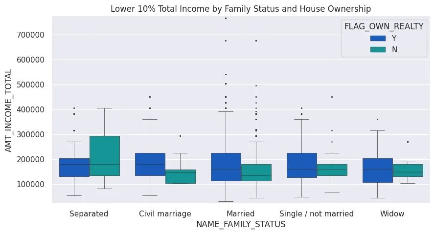
ten_percent = round((len(credit_approv_df)/100*10))

plt.figure(figsize=(10, 5))
plt.title('Lower 10% Total Income by Family Status and House Ownership')

plot = sns.boxplot(
    data=credit_approv_df.tail(ten_percent),
    y='AMT_INCOME_TOTAL',
    x='NAME_FAMILY_STATUS',
    hue='FLAG_OWN_REALTY',
    palette='winter',
    orient='v',
    linewidth=0.5,
    fliersize=1
)

plot.set_ylim(
    (credit_approv_df.tail(ten_percent)['AMT_INCOME_TOTAL'].min() - 10000),
    (credit_approv_df.tail(ten_percent)['AMT_INCOME_TOTAL'].max() + 10000)
)

plt.savefig('assets/Seaborn_Cheat_Sheet_22.webp', bbox_inches='tight')
Violinplot
plt.figure(figsize=(12, 5))
plt.title('Tips Distribution')

sns.violinplot(
    x=tips_df['tip'],
    color='mediumspringgreen'
)

plt.savefig('assets/Seaborn_Cheat_Sheet_25.webp', bbox_inches='tight')

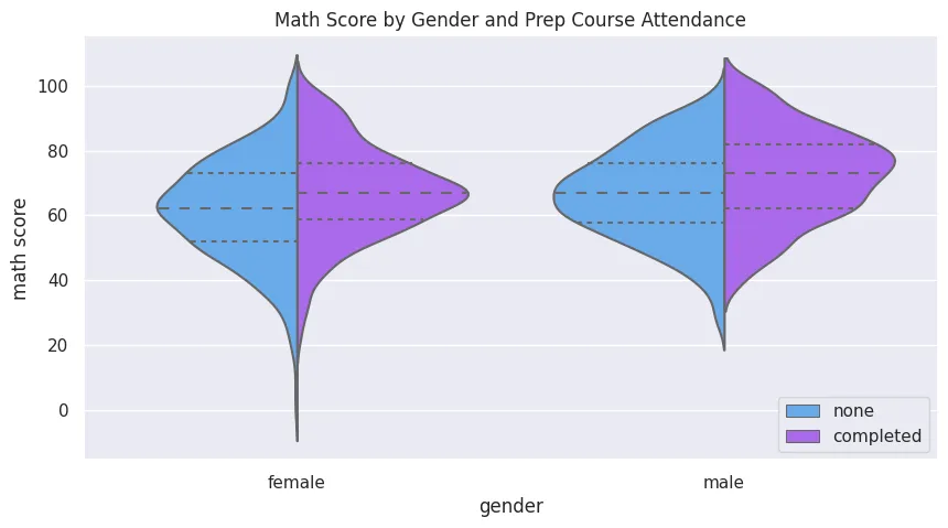
plt.figure(figsize=(10, 5))
plt.title('Math Score by Gender and Prep Course Attendance')

sns.violinplot(
    data=students_performance_df,
    x='gender',
    y='math score',
    hue='test preparation course',
    palette='cool',
    orient='v',
    inner='quartile',
    bw=0.3,
    split=True
)
plt.legend(loc='lower right')
plt.savefig('assets/Seaborn_Cheat_Sheet_09.webp', bbox_inches='tight')
Swarmplot
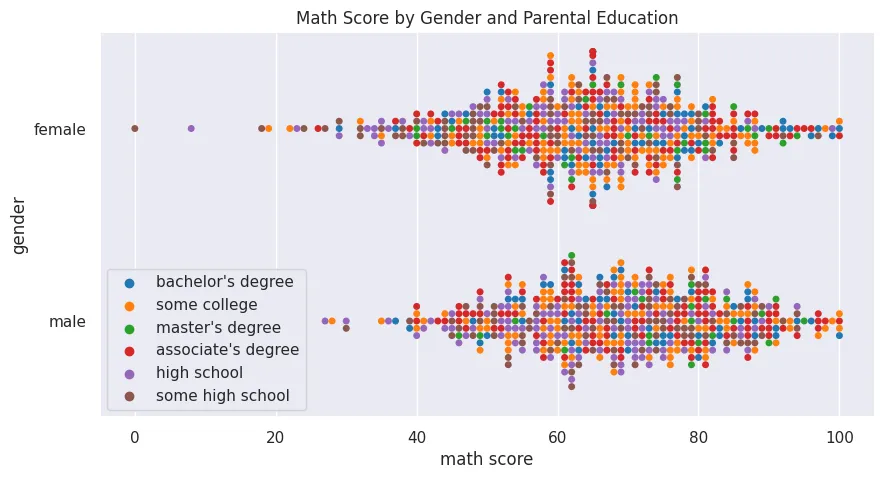
plt.figure(figsize=(10, 5))
plt.title('Math Score by Gender and Parental Education')

sns.swarmplot(
    data=students_performance_df,
    x='math score',
    y='gender',
    hue='parental level of education',
    palette='tab10'
)
plt.legend(loc='lower left')
plt.savefig('assets/Seaborn_Cheat_Sheet_10.webp', bbox_inches='tight')
colour_palette = ['dodgerblue', 'mediumspringgreen']

plt.figure(figsize=(12, 5))
plt.title('Tips by Day and Time of the Day')

sns.swarmplot(
    data=tips_df,
    x='day',
    y='tip',
    hue='time',
    palette=colour_palette
)
plt.legend(loc='upper right')
plt.savefig('assets/Seaborn_Cheat_Sheet_24.webp', bbox_inches='tight')

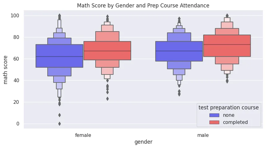
Boxenplot
plt.figure(figsize=(10, 5))
plt.title('Math Score by Gender and Prep Course Attendance')

sns.boxenplot(
    data=students_performance_df,
    x='gender',
    y='math score',
    hue='test preparation course',
    palette='seismic',
    orient='v'
)
plt.savefig('assets/Seaborn_Cheat_Sheet_11.webp', bbox_inches='tight')
Comparison Plots��
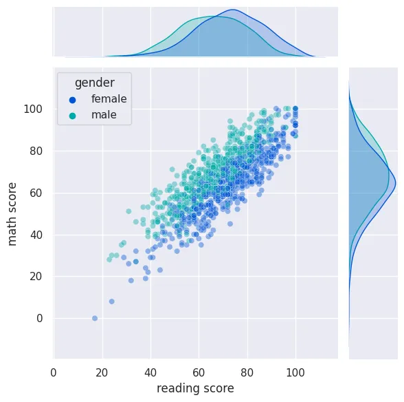
Jointplot
sns.jointplot(
    data=students_performance_df,
    x='reading score',
    y='math score',
    kind='scatter',
    hue='gender',
    palette='winter',
    alpha=0.4
)

plt.savefig('assets/Seaborn_Cheat_Sheet_12.webp', bbox_inches='tight')
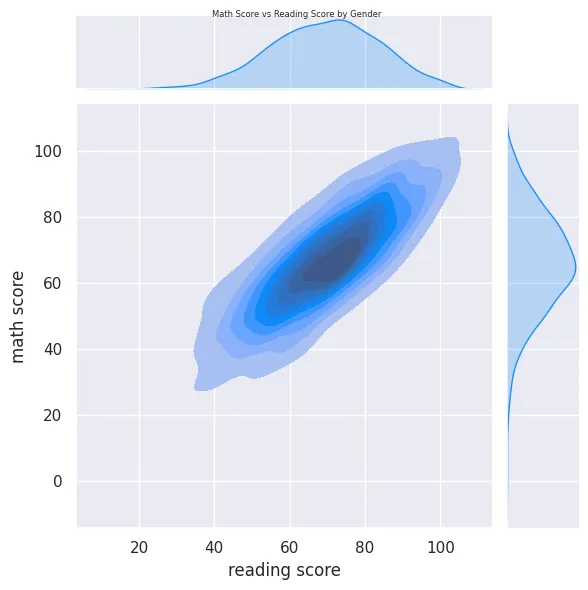
plot = sns.jointplot(
    data=students_performance_df,
    x='reading score',
    y='math score',
    kind='kde',
    fill=True,
    color='dodgerblue'
)

plot.fig.suptitle('Math Score vs Reading Score by Gender',
                  fontsize=6, fontdict={"weight": "normal"})

plt.savefig('assets/Seaborn_Cheat_Sheet_13.webp', bbox_inches='tight')
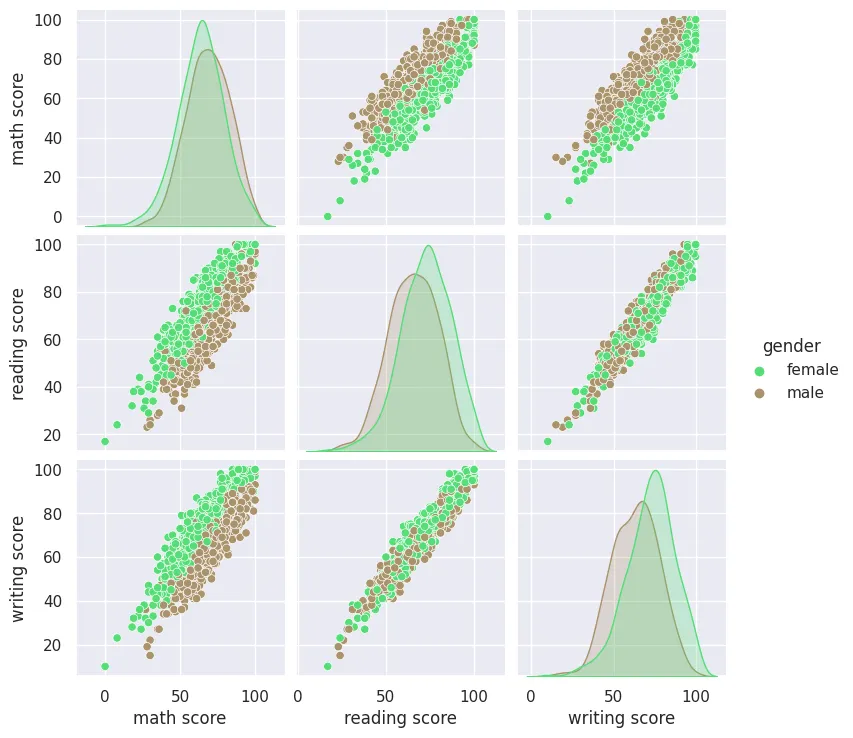
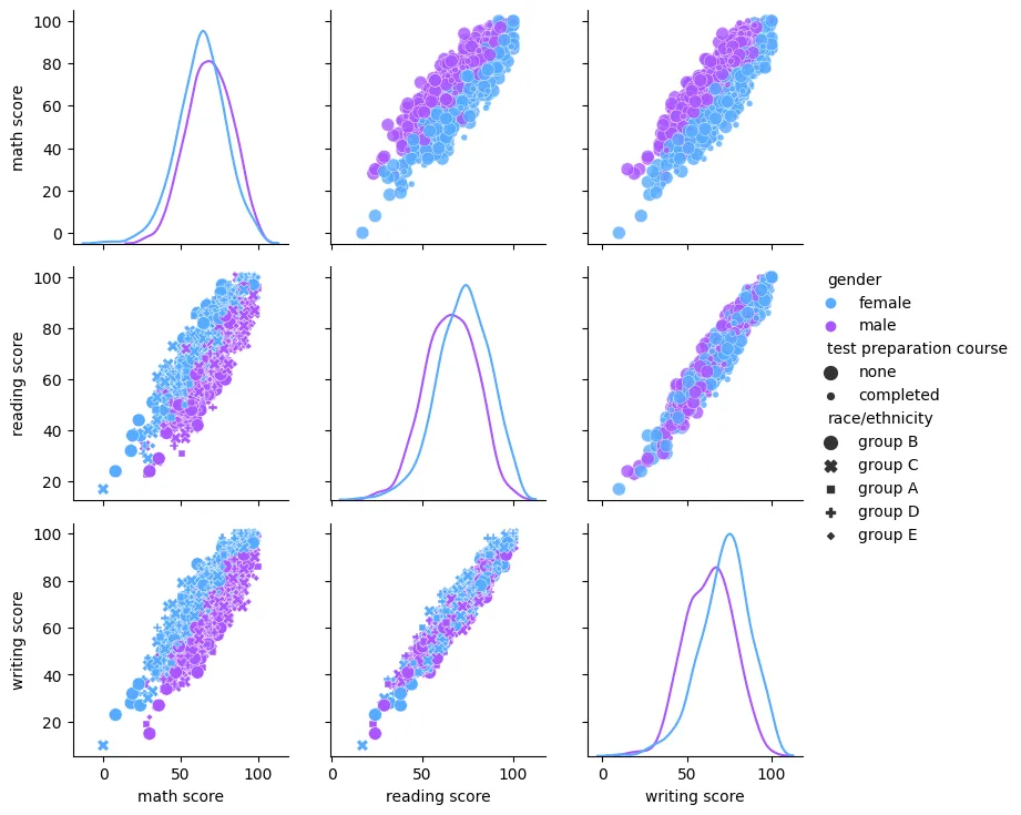
Pairplot
sns.pairplot(
    data=students_performance_df,
    hue='gender',
    palette='terrain'
)

plt.savefig('assets/Seaborn_Cheat_Sheet_14.webp', bbox_inches='tight')
Grid Plots
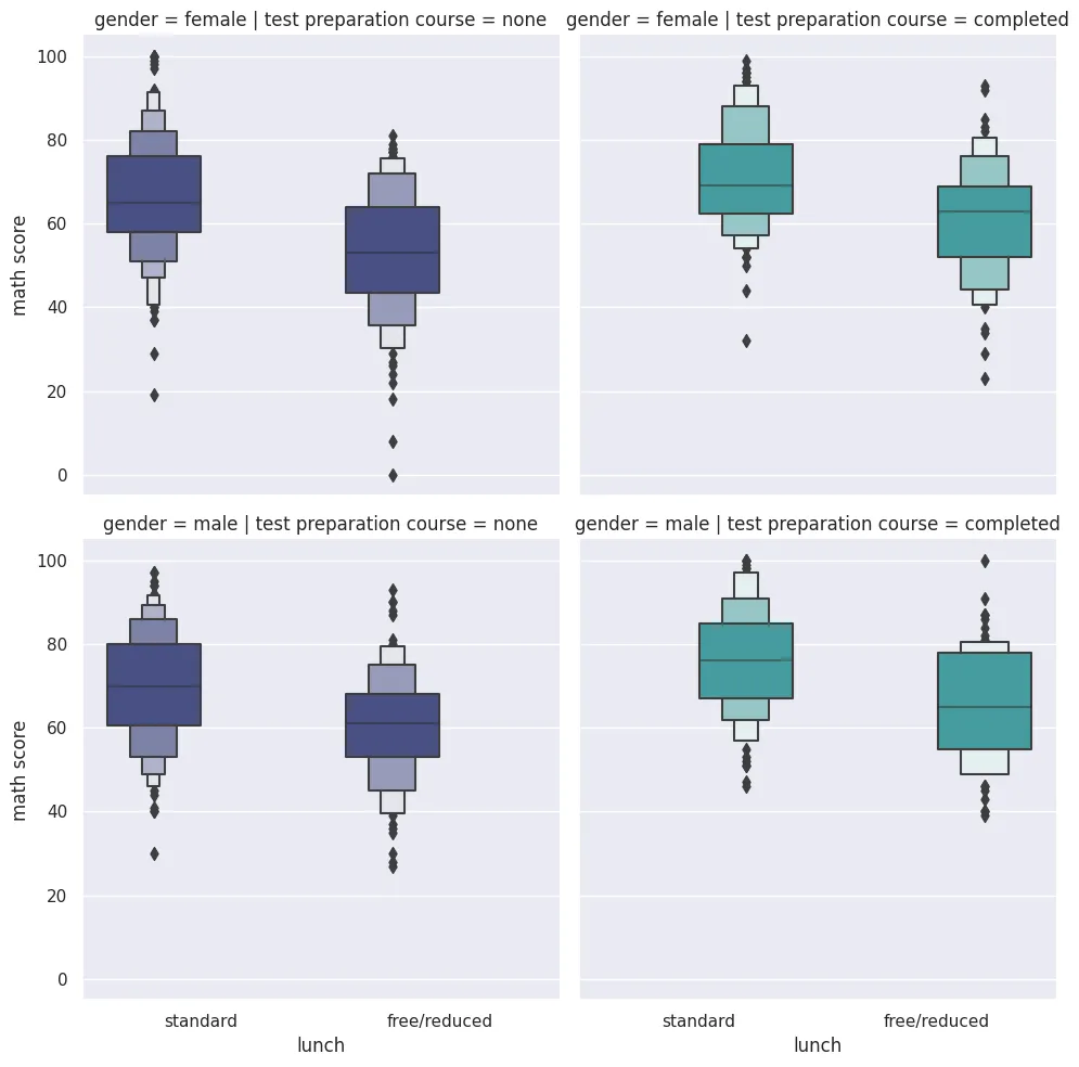
Catplot
sns.catplot(
    data=students_performance_df,
    x='lunch',
    y='math score',
    kind='boxen',
    hue='test preparation course',
    palette='mako',
    col='test preparation course',
    row='gender'
)

plt.savefig('assets/Seaborn_Cheat_Sheet_15.webp', bbox_inches='tight')
Pairgrid
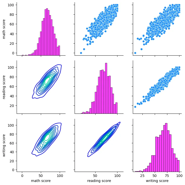
grid = sns.PairGrid(students_performance_df)

grid = grid.map_upper(sns.scatterplot, color = 'dodgerblue')
grid = grid.map_lower(sns.kdeplot, cmap = 'winter')
grid = grid.map_diag(sns.histplot, color='fuchsia')

plt.savefig('assets/Seaborn_Cheat_Sheet_16.webp', bbox_inches='tight')
grid = sns.PairGrid(
    data=students_performance_df,
    hue='gender',
    palette='cool'
)

grid = grid.map_upper(
    sns.scatterplot,
    size=students_performance_df["test preparation course"],
    alpha=0.8
)
grid = grid.map_lower(
    sns.scatterplot,
    size=students_performance_df["race/ethnicity"],
    style=students_performance_df["race/ethnicity"]
)
grid = grid.map_diag(sns.kdeplot)

grid = grid.add_legend(title="", adjust_subtitles=True)

plt.savefig('assets/Seaborn_Cheat_Sheet_17.webp', bbox_inches='tight')
Matrix Plots
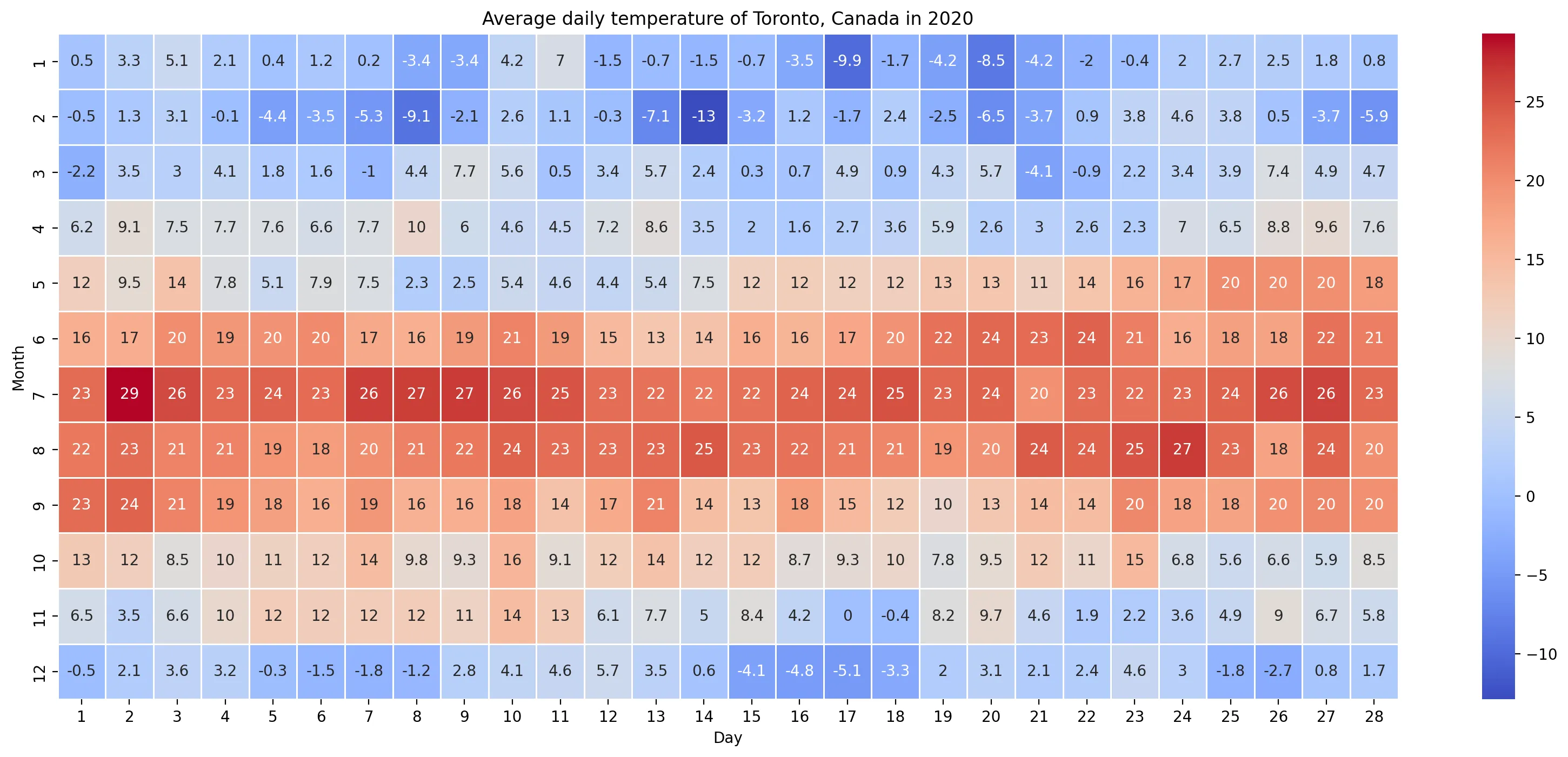
Heatmap
plt.figure(figsize=(20, 8), dpi=200)
plt.title('Average daily temperature of Toronto, Canada in 2020')

sns.heatmap(
    country_table_df,
    linewidth=0.5,
    cmap='coolwarm',
    annot=True
)

plt.savefig('assets/Seaborn_Cheat_Sheet_18.webp', bbox_inches='tight')
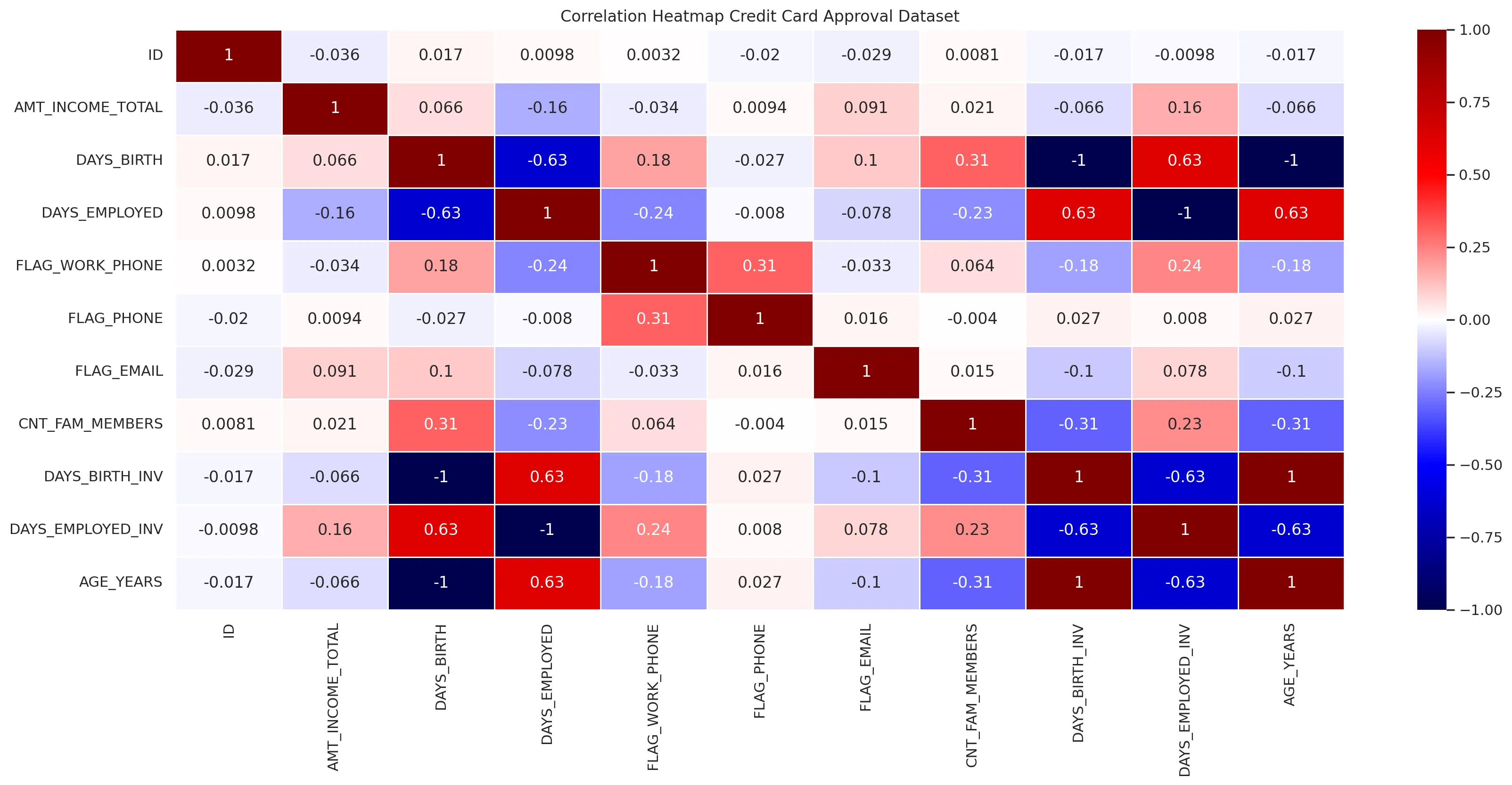
credit_approv_df_only_numeric = credit_approv_df.drop([
    'CODE_GENDER',
    'FLAG_OWN_CAR',
    'FLAG_OWN_REALTY',
    'NAME_INCOME_TYPE',
    'NAME_EDUCATION_TYPE',
    'NAME_FAMILY_STATUS',
    'NAME_FAMILY_STATUS',
    'NAME_HOUSING_TYPE',
    'OCCUPATION_TYPE',
    'CLASSIFICAO',
    'CNT_CHILDREN',
    'FLAG_MOBIL'
    ], axis=1)

credit_approv_df_dropna = credit_approv_df_numeric.dropna(how='all')


plt.figure(figsize=(20, 8), dpi=200)
plt.title('Correlation Heatmap Credit Card Approval Dataset')

sns.heatmap(
    credit_approv_df_dropna.corr(),
    linewidth=0.5,
    cmap='seismic',
    annot=True
)

plt.savefig('assets/Seaborn_Cheat_Sheet_23.webp', bbox_inches='tight')
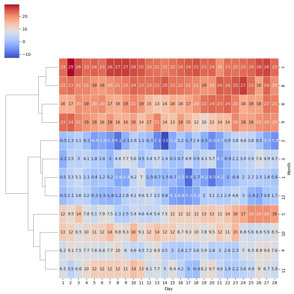
Clustermap
sns.clustermap(
    country_table_df,
    linewidth=0.5,
    cmap='coolwarm',
    annot=True,
    col_cluster=False
)

plt.savefig('assets/Seaborn_Cheat_Sheet_19.webp', bbox_inches='tight')
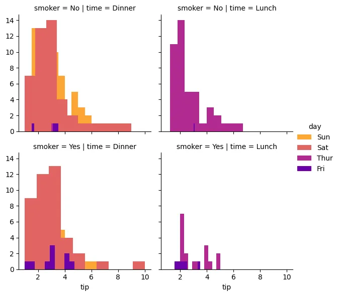
Facet Grid
plot = sns.FacetGrid(
    tips_df,
    col='time',
    row='smoker',
    hue='day',
    palette='plasma_r',
    sharex=True
)

plot = plot.map(
    plt.hist,
    'tip'
)

plot = plot.add_legend()

plt.savefig('assets/Seaborn_Cheat_Sheet_26.webp', bbox_inches='tight')
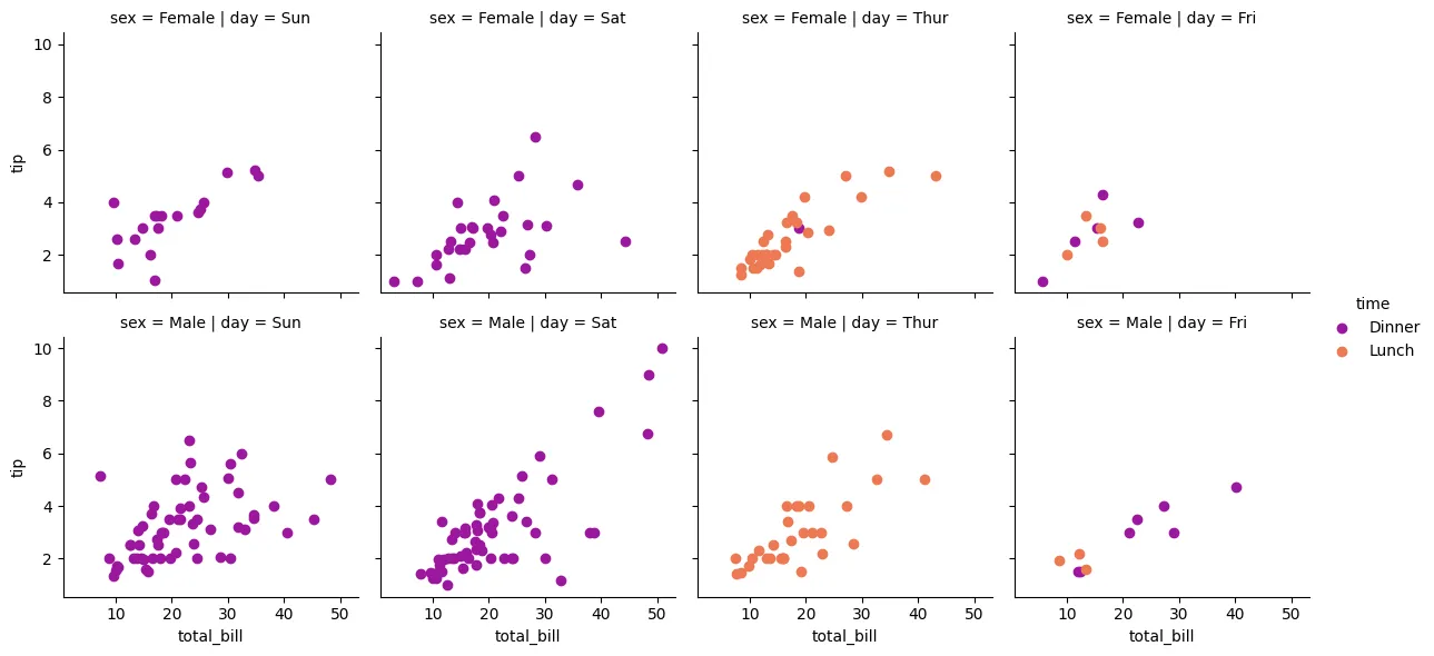
plot = sns.FacetGrid(
    tips_df,
    col='day',
    row='sex',
    hue='time',
    palette='plasma'
)

plot = plot.map(
    plt.scatter,
    'total_bill', 'tip',
)

plot = plot.add_legend()
plt.savefig('assets/Seaborn_Cheat_Sheet_27.webp', bbox_inches='tight')