create-react-app and Material-UI
This is a practice run to add some Material Design to a react app, generated by the create-react-app starter kit. So let's get started!
npm install -g create-react-app

create-react-app reactive-material
cd reactive-material
npm start
Then open http://localhost:3000/ to see your app. You don’t need to install or configure tools like Webpack or Babel. They are preconfigured and hidden so that you can focus on the code. Just create a project, and you’re good to go.
Table of Content
01 Installing Material-UI
Now that we made sure that our React App is up-and-running, let's CTRL+C the process and follow the Installation Instructions for Material-UI (v.1.0.0 beta):
To install and save in your package.json dependencies, run:
npm install material-ui@next --save
Next, Typography: The Roboto font, that Material-UI is optimized for, can be installed by:
npm install typeface-roboto --save
Remember, the Roboto font will not be automatically loaded by Material-UI - but need to be imported to the entrypoint of your app: import 'typeface-roboto' !
Next, Material Design Icons. Install the icons using npm package manager:
npm install material-design-icons --save
And last but not least - In order to use prebuilt SVG Material icons, such as those found in the component demos you have to install the material-ui-icons package:
npm install material-ui-icons --save
Now that you downloaded the more interesting part of the internet, let's start with React!
02 Using Material-UI Components
The basic usage is simple: e.g. adding a ButtonAppBar - create a JavaScript file /src/ButtonAppBar.js that is named after the component that you want to use. Copy the code from the Material-UI page and fine tune the CSS and JSX, where needed:
import React from 'react';
import PropTypes from 'prop-types';
import { withStyles } from 'material-ui/styles';
import AppBar from 'material-ui/AppBar';
import Toolbar from 'material-ui/Toolbar';
import Typography from 'material-ui/Typography';
import Button from 'material-ui/Button';
import IconButton from 'material-ui/IconButton';
import MenuIcon from 'material-ui-icons/Menu';

const styles = theme => ({
  root: {
    width: '100%',
    position: 'fixed',
    top: 0,
    left: 0,
    zIndex: 10,
  },
  flex: {
    flex: 1,
  },
  menuButton: {
    marginLeft: -12,
    marginRight: 20,
  },
});

function ButtonAppBar(props) {
  const classes = props.classes;
  return (
    <div className={classes.root}>
      <AppBar position='static'>
        <Toolbar>
          <IconButton className={classes.menuButton} color='contrast' aria-label='Menu'>
            <MenuIcon />
          </IconButton>
          <Typography type='title' color='inherit' className={classes.flex}>
            Reactive Material
          </Typography>
          <Button color='contrast'>Material Button</Button>
        </Toolbar>
      </AppBar>
    </div>
  );
}

ButtonAppBar.propTypes = {
  classes: PropTypes.object.isRequired,
};

export default withStyles(styles)(ButtonAppBar);
Now go to /src/App.js, import your component and use it inside the JSX code:
import React, { Component } from 'react';
import styles from './app.css';
import 'typeface-roboto';

import ButtonAppBar from './ButtonAppBar'

class App extends Component {
  render() {
    return (
      <div>
        <header className={styles.header}>
          <ButtonAppBar />
        </header>
      </div>
    );
  }
}

export default App;
Restart your app with npm start and reload localhost:3000 - voila' :
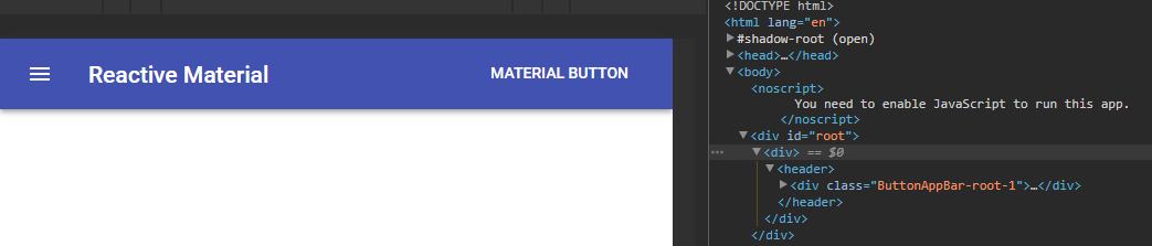
As you can see from the examples, we added a few custom styles to our app. /src/index.js imports the complete /src/index.css file scoped globally. While our /src/app.js only imports app specific styles *import styles from /app.css, that are available with the className attribute /header className={styles.header}. You can use locally scoped CSS Modules for each component that you add to your app!
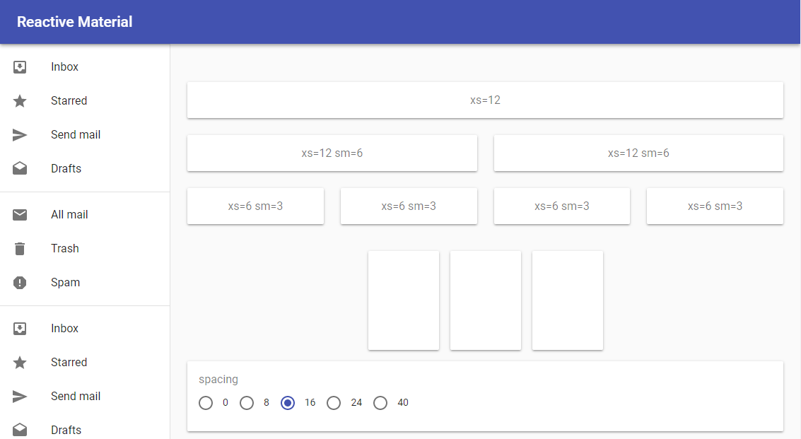
03 Final Design
This is not yet a production ready design - but it will be a good starting point for future projects. I ended up removing the ButtonAppBar and replaced it with Responsive Drawer component. It gave me a little bit of an headache that the Navbar, that is included here, was not sticky. But everything seems to work now - beside some necessary cleanUp inside the JSX. All other components are now nested inside the Drawer component, that is then nested inside the main app component:
Would you use create-react-app and Material-UI in a future project? Absolutely!