Carbon Design System in React.js - Part I

In the previous step used Create-React-App to scaffold a react app and added Electron as a wrapper for my App. I now want to use the IBM Carbon Design System to add a few ready-to-use react design components to my app.
Note: compiling the SASS styles takes a while when starting up the Electron app. Be patient :)
Installation
Carbon
Install the Carbon dependencies:
npm install carbon-components@10.41.0 carbon-components-react@7.41.0 @carbon/icons-react@10.37.0 carbon-icons@7.0.7
Sass
We need to run a Sass build as the Carbon styles are authored in Sass, so run the following command to install sass (!! v1.29.0 !!) as a dependency:
npm install sass@1.29.0
To avoid having to add the ~ prefix when importing SCSS files from node_modules, create a .env file at the project root that contains:
LINUX
SASS_PATH="node_modules"
Windows
SASS_PATH=./node_modules
Import carbon-component Styles
In the src directory, rename index.css as index.scss. Then in index.js update the index.css import to index.scss. In index.scss, import the Carbon styles by adding the following at the top of the file:
@import 'carbon-components/scss/globals/scss/styles.scss';
Making this change to index.scss will cause all of the Carbon Sass to re-compile. Let’s speed this up by moving our custom app Sass into a separate file, app.scss in the ./src directory, and import that from App.js.
import './app.scss';
By modifying index.scss as little as possible and storing all app-specific styling in app.scss we will make compile times much quicker.
Testing Carbon Components
I'll import a Button from Carbon to test that our dependencies are working properly. At the top of App.js, import the Button by adding the following:
import { Button } from 'carbon-components-react';
And add the button to my App component:
<Button>Button</Button>
If the button shows up with the correct Carbon styling your setup is ready to go!
Add Carbon UI Shell
Next, I am going to create a React component called AppHeader to use with the UI Shell Carbon component. In the ./src directory, create a components directory and inside of that, a AppHeader directory. Create the following files inside ./src/components/AppHeader:
src/components/AppHeader
├──_app-header.scss
├──index.js
└──AppHeader.js
Add UI Shell Sass
Next, in src/app.scss, we’ll import our AppHeader styles. Your file should now look like this:
@import './components/AppHeader/app-header.scss';
Import and export the header
In src/components/AppHeader/index.js, import and export our AppHeader component like so:
import AppHeader from './AppHeader';
export default AppHeader;
Next we’ll import our Carbon UI Shell components into AppHeader.js. Set up the file like so:
import React from 'react';
import {
  Header,
  HeaderContainer,
  HeaderName,
  HeaderNavigation,
  HeaderMenuButton,
  HeaderMenuItem,
  HeaderGlobalBar,
  HeaderGlobalAction,
  SkipToContent,
  SideNav,
  SideNavItems,
  HeaderSideNavItems,
} from 'carbon-components-react';

  const AppHeader = () => (
    <HeaderContainer
      render={({ isSideNavExpanded, onClickSideNavExpand }) => (
        <Header aria-label="Carbon">
          <SkipToContent />
          <HeaderMenuButton
            aria-label="Open menu"
            onClick={onClickSideNavExpand}
            isActive={isSideNavExpanded}
          />
          <HeaderName href="/" prefix="INSTAR">
            Carbon
          </HeaderName>
          <HeaderNavigation aria-label="Carbon">
            <HeaderMenuItem href="/about">About</HeaderMenuItem>
          </HeaderNavigation>
          <SideNav
            aria-label="Side navigation"
            expanded={isSideNavExpanded}
            isPersistent={false}>
            <SideNavItems>
              <HeaderSideNavItems>
                <HeaderMenuItem href="/about">About</HeaderMenuItem>
              </HeaderSideNavItems>
            </SideNavItems>
          </SideNav>
          <HeaderGlobalBar>
            <HeaderGlobalAction aria-label="Notifications">
              <Notification20 />
            </HeaderGlobalAction>
            <HeaderGlobalAction aria-label="User Avatar">
              <UserAvatar20 />
            </HeaderGlobalAction>
            <HeaderGlobalAction aria-label="App Switcher">
              <AppSwitcher20 />
            </HeaderGlobalAction>
          </HeaderGlobalBar>
        </Header>
      )}
    />
  );

  export default AppHeader;
Import icons
Now let’s import the icons from our @carbon/icons-react elements package. In the AppHeader.js file, we need to import each individual icon we will use:
import {
  AppSwitcher20,
  Notification20,
  UserAvatar20,
} from '@carbon/icons-react';
Render the header
Next we’ll render our UI Shell by importing our AppHeader component and Content into App.js. Your imports should look like this:
import React, { Component } from 'react';
import { Button, Content } from 'carbon-components-react';
import AppHeader from './components/AppHeader';
Our return currently just contains a Button. Let’s update that to include our imported components. This should look like the following:
function App() {
  return (
    <>
      <AppHeader />
      <Content>
        <Button>Button</Button>
      </Content>
    </>
  );
}

Create pages
Create two folders in src/content and prepare folder for a landing and a about page:
src/content/LandingPage
├── _landing-page.scss
├── index.js
└── LandingPage.js
src/content/AboutPage
├── _about-page.scss
├── index.js
└── AboutPage.js
Import Content Sass
Next, we’ll import our content Sass files in app.scss, like so:
@import './components/AppHeader/app-header.scss';
@import './content/LandingPage/landing-page.scss';
@import './content/AboutPage/about-page.scss';
Import and Export Content Pages
Starting with LandingPage, just like with our header, we need to export the component in src/content/LandingPage/index.js by adding:
import LandingPage from './LandingPage';
export default LandingPage;
Next in LandingPage.js, we’ll create our component:
import React from 'react';
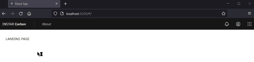
const LandingPage = () => {
return <div>LANDING PAGE</div>;
};
export default LandingPage;
In src/content/AboutPage/index.js, import and export the AboutPage component like so:
import AboutPage from './AboutPage';
export default AboutPage;
Then in AboutPage.js create the component:
import React from 'react';
const AboutPage = () => {
  return <div>About PAGE</div>;
};
export default AboutPage;
Add Routing
We’ve updated our app to render our header, but now we need to add routing functionality. To do this we need to install react-router-dom:
npm install react-router-dom@5.2.0
First, we need to wrap our app in the Router component. In the root src/index.js, add the import:
import { HashRouter as Router } from 'react-router-dom';
Then, update the render() function to include the Router:
ReactDOM.render(
  <React.StrictMode>
    <Router>
      <App />
    </Router>,
  </React.StrictMode>,
  document.getElementById('root')
);
In order to render our content pages, we need to add the following imports in src/App.js below our existing imports.
import { Route, Switch } from 'react-router-dom';
import LandingPage from './content/LandingPage';
import AboutPage from './content/AboutPage';
Now inside src/App.js Content we’ll our dummy button with the following:
<Switch>
  <Route exact path="/" component={LandingPage} />
  <Route path="/about/" component={AboutPage} />
</Switch>
After that we need to do a couple quick fixes to the UI Shell to have it work with the React router. Add the Link import in src/components/AppHeader/AppHeader.js:
import { Link } from 'react-router-dom';
We need to use the Link component instead of the default anchor elements to prevent full page reload when navigating to different pages with React Router. To use Link, update the HeaderName component in src/components/AppHeader/AppHeader.js to use the element prop and replace the href with to:
<HeaderName element={Link} to="/" prefix="INSTAR">
  Carbon
</HeaderName>
Do the same with the components that contain href="/about" in src/components/AppHeader/AppHeader.js, updating them to:
<HeaderMenuItem element={Link} to="/about">
  About
</HeaderMenuItem>