Carbon Design System in React.js - Part II

Continuation of Part I - Using the IBM Carbon Design System in a React App.
IE11 Polyfills
Not sure if IE11 is still a thing, but some Carbon components require IE11 polyfills. I am going to install core-js and add these imports to the top of the root src/index.js:
npm install --save-dev core-js
import 'core-js/modules/es7.array.includes';
import 'core-js/modules/es6.array.fill';
import 'core-js/modules/es6.string.includes';
import 'core-js/modules/es6.string.trim';
import 'core-js/modules/es7.object.values';
Install Grid
In our last step we added our styles, component and icon packages. Now that we’re building the pages with grid, we need to install one more Carbon package:
npm install @carbon/grid@10.17.0
In src/index.scss, we need to configure our grid to use 16 columns instead of the default 12 columns. The feature flag needs to come before the Carbon styles.scss import:
$feature-flags: (
  grid-columns-16: true,
);
Add Landing Page Grid
Let’s add our grid elements to src/content/LandingPage/LandingPage.js.
In order to use the grid, we need to wrap everything in a <div className="bx--grid">. I can continue to make rows by adding a <div className="bx--row"> inside the grid, as well as make columns within those rows by adding <div className="bx--col-[breakpoint]-[size]">.
Our column sizes are specified by the number of columns they’ll be spanning. If we use bx--col-lg-4, it means it’ll span 4 of the 16 columns. If we use bx--col-lg-8 it means it’ll span 8 of the 16 columns, and so on.
return (
  <div className="bx--grid bx--grid--full-width landing-page">
    <div className="bx--row landing-page__banner">
      <div className="bx--col-lg-16">1</div>
    </div>
    <div className="bx--row landing-page__r2">
      <div className="bx--col-md-4 bx--col-lg-7">7/16</div>
      <div className="bx--col-md-4 bx--offset-lg-1 bx--col-lg-8">8/16</div>
    </div>
    <div className="bx--row landing-page__r3">
      <div className="bx--col-md-4 bx--col-lg-4">1/4</div>
      <div className="bx--col-md-4 bx--col-lg-4">1/4</div>
      <div className="bx--col-md-4 bx--col-lg-4">1/4</div>
      <div className="bx--col-md-4 bx--col-lg-4">1/4</div>
    </div>
  </div>
);
I added a class of bx--grid--full-width to the grid container since our rows need to expand the whole page without any margins. I also added some custom classes like landing-page, landing-page__banner, landing-page__r2, etc., which I will use later.
Also, take notice of the second row. The tab content only covers 7 columns at this large viewport to prevent overly-large line lengths, so we needed to add a 1 column offset bx--offset-lg-1 to second column to fill the full 16 columns in the grid. Then, both of those columns have bx--col-md-4 classes so they are of equal width at medium-sized viewports.
Building Landing Page
First Row - Breadcrumbs
In our first row we’ll need a BreadCrumb component. First, let’s import the components we need to src/content/LandingPage/LandingPage.js:
import { Breadcrumb, BreadcrumbItem } from 'carbon-components-react';
We can now add our component to the first row, along with a header, like so:
<div className="bx--row landing-page__banner">
  <div className="bx--col-lg-16">
    <Breadcrumb noTrailingSlash>
      <BreadcrumbItem>
        <a href="/">Introduction</a>
      </BreadcrumbItem>
    </Breadcrumb>
    <h1 className="landing-page__heading">INSTAR Carbon</h1>
  </div>
</div>
Second Row - Tabs
In our second row we’ll need Tabs and Button components. We’ll update the carbon-components-react import in src/content/LandingPage/LandingPage.js to:
import {
  Breadcrumb,
  BreadcrumbItem,
  Button,
  Tabs,
  Tab,
} from 'carbon-components-react';
Before we can render the tabs, we need to add some props for the component after the import in src/content/LandingPage/LandingPage.js. These example props came from the React Tabs Story in Storybook:
const props = {
  tabs: {
    selected: 0,
    role: 'navigation',
  },
  tab: {
    role: 'presentation',
    tabIndex: 0,
  },
};
Modify the second row to use the Tab component:
<div className="bx--row landing-page__r2">
  <div className="bx--col bx--no-gutter">
    <Tabs {...props.tabs}>
      <Tab {...props.tab} label="Hello World!">
        <div className="bx--grid bx--grid--no-gutter bx--grid--full-width">
          <div className="bx--row landing-page__tab-content">
            <div className="bx--col-md-4 bx--col-lg-7">
              Consectetur adipisicing elit. Eveniet eos repellendus aspernatur molestias autem sed soluta voluptate.
            </div>
            <div className="bx--col-md-4 bx--offset-lg-1 bx--col-lg-8">
              Voluptatibus numquam placeat dicta, delectus commodi iure, quam, distinctio enim consequatur repudiandae autem!
            </div>
          </div>
        </div>
      </Tab>
      <Tab {...props.tab} label="Contact">
        <div className="bx--grid bx--grid--no-gutter bx--grid--full-width">
          <div className="bx--row landing-page__tab-content">
            <div className="bx--col-lg-16">
              Lorem ipsum dolor sit amet consectetur adipisicing elit. Iusto quas in quasi, quisquam reiciendis repellendus natus fugit? Voluptatibus numquam placeat dicta, delectus commodi iure, quam, distinctio enim consequatur repudiandae autem!
            </div>
          </div>
        </div>
      </Tab>
      <Tab {...props.tab} label="More">
        <div className="bx--grid bx--grid--no-gutter bx--grid--full-width">
          <div className="bx--row landing-page__tab-content">
            <div className="bx--col-lg-16">
              Lorem ipsum, dolor sit amet consectetur adipisicing elit. Magni, inventore error officiis suscipit eos doloribus quam quidem, sapiente voluptas repellendus debitis iusto rem voluptatum cumque facilis, modi excepturi minus officia?
            </div>
          </div>
        </div>
      </Tab>
    </Tabs>
  </div>
</div>
Next, we’ll need to add some styling overrides to move the tabs to the right on large viewports. Create a file _overrides.scss in src/content/LandingPage with this declaration block.
.landing-page__r2 .bx--tabs--scrollable {
  transform: translateZ(0);
  justify-content: flex-end;
}
.landing-page__r2 .bx--tab-content {
  padding: 0;
}
Then in src/content/LandingPage/_landing-page.scss add this import at the top of the file:
@import './overrides.scss';
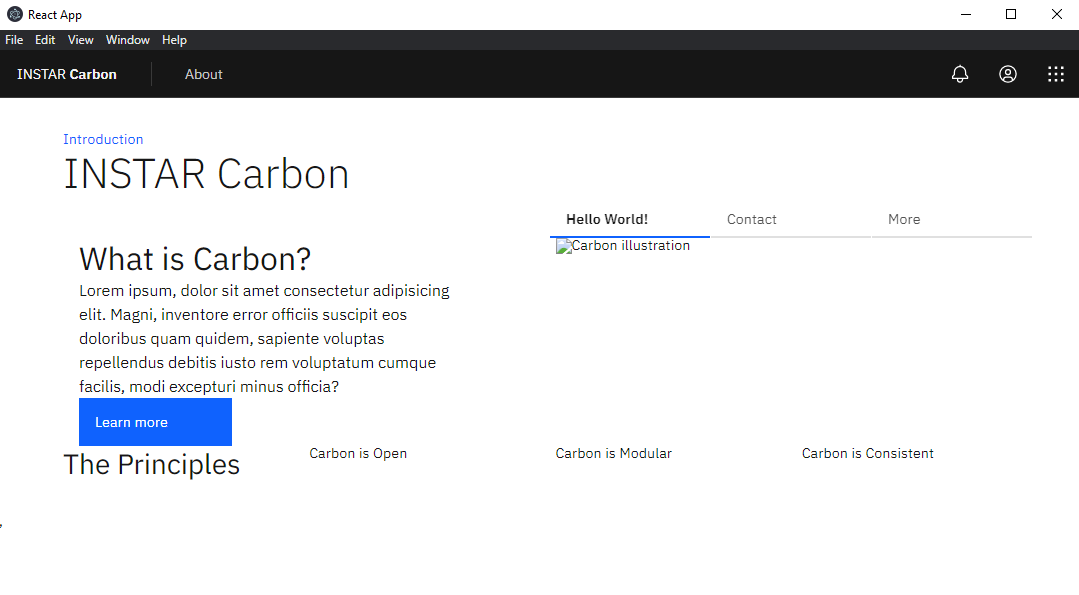
We can now add our images and text for each column in the Hello World! tab in src/content/LandingPage/LandingPage.js:
<Tab {...props.tab} label="Hello World!">
  <div className="bx--grid bx--grid--no-gutter bx--grid--full-width">
    <div className="bx--row landing-page__tab-content">
      <div className="bx--col-md-4 bx--col-lg-7">
        <h2 className="landing-page__subheading">
          What is Carbon?
        </h2>
        <p className="landing-page__p">
          Lorem ipsum, dolor sit amet consectetur adipisicing elit. Magni,
          inventore error officiis suscipit eos doloribus quam quidem,
          sapiente voluptas repellendus debitis iusto rem voluptatum cumque
          facilis, modi excepturi minus officia?
        </p>
        <Button>Learn more</Button>
      </div>
      <div className="bx--col-md-4 bx--offset-lg-1 bx--col-lg-8">
        <img
          className="landing-page__illo"
          src={`${process.env.PUBLIC_URL}/tab-illo.png`}
          alt="Carbon illustration"
        />
      </div>
    </div>
  </div>
</Tab>
Now let’s set the image size in src/content/LandingPage/_landing-page.scss:
.landing-page__illo {
  max-width: 100%;
}
Third Row - Header
The third row will be created later, so I’ll just add the headers for now src/content/LandingPage/LandingPage.js:
<div className="bx--row landing-page__r3">
  <div className="bx--col-md-4 bx--col-lg-4">
    <h3 className="landing-page__label">The Principles</h3>
  </div>
  <div className="bx--col-md-4 bx--col-lg-4">Carbon is Open</div>
  <div className="bx--col-md-4 bx--col-lg-4">Carbon is Modular</div>
  <div className="bx--col-md-4 bx--col-lg-4">Carbon is Consistent</div>
</div>