Carbon Design System in React.js - Part III

Continuation of Part II - Using the IBM Carbon Design System in a React App.
Landing Page Styles
I’ll be using the Carbon Design spacing tokens in src/app.scss, add these imports at the top of the file so we can use Carbon breakpoints, tokens, and typography Sass mixins and functions:
@import 'carbon-components/scss/globals/scss/vendor/@carbon/type/scss/font-family.scss';
@import 'carbon-components/scss/globals/scss/vendor/@carbon/layout/scss/breakpoint.scss';
@import 'carbon-components/scss/globals/scss/typography.scss';
@import 'carbon-components/scss/globals/scss/vars.scss';
Banner
We are now able to use the spacing tokens in src/content/LandingPage/_landing-page.scss to add some space above the breadcrumb and below the heading:
.landing-page__banner {
  padding-top: $spacing-05;
  padding-bottom: $spacing-07 * 4;
}
The banner should have a light gray background colour which we can define in a SASS mixin in src/content/LandingPage/_mixins.scss using a Carbon Colour Token $ui-01:
@mixin landing-page-background() {
  background-color: $ui-01;
  position: relative;
  &::before {
    content: '';
    position: absolute;
    left: -$spacing-06;
    top: 0;
    right: -$spacing-06;
    bottom: 0;
    background: $ui-01;
    z-index: -1;
  }
}
For this to take effect we need to import our mixin into src/content/LandingPage/_landing-page.scss:
@import './mixins.scss';
@import './overrides.scss';
And update the .landing-page__banner declaration block src/content/LandingPage/_landing-page.scss:
.landing-page__banner {
  padding-top: $spacing-05;
  padding-bottom: $spacing-07 * 4;
  @include landing-page-background;
}
And while we are at it - let's handle the heading type using Carbon Type Tokens
.landing-page__heading {
  @include carbon--type-style('productive-heading-05');
}
Introduction Block
Again, we need to take care of the spacing and types to make this block on the landing page fit into our design - src/content/LandingPage/_landing-page.scss:
.landing-page__r2 {
  margin-top: rem(-40px);
}

.landing-page__tab-content {
  padding-top: $layout-05;
  padding-bottom: $layout-05;
}

.landing-page__subheading {
  @include carbon--type-style('productive-heading-03');
  @include carbon--font-weight('semibold');
}

.landing-page__r3 {
  padding-top: $spacing-09;
  padding-bottom: $spacing-09;
  @include landing-page-background;
}

.landing-page__label {
  @include carbon--type-style('heading-01');
}
About Page Styles
Adding the Page Grid
Now in our AboutPage.js we’ll add our grid containers in the return section - src/content/AboutPage/AboutPage.js:
return (
  <div className="bx--grid bx--grid--full-width bx--grid--no-gutter repo-page">
    <div className="bx--row repo-page__r1">
      <div className="bx--col-lg-16">Data table will go here</div>
    </div>
  </div>
);
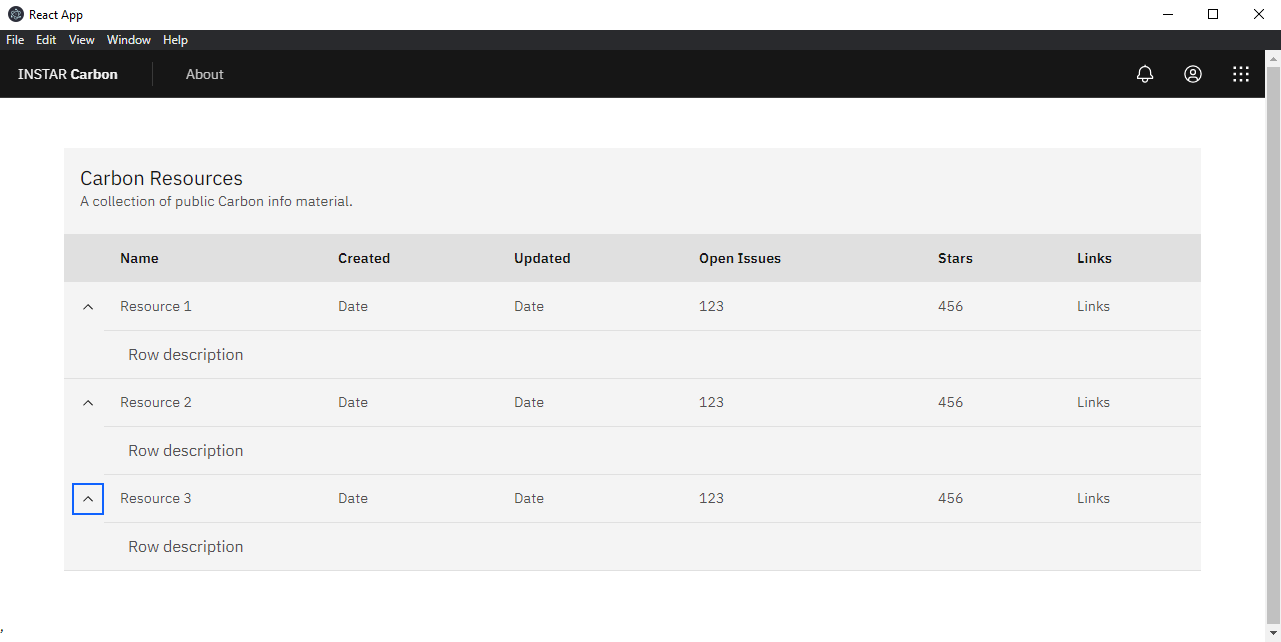
The About page should contain a table with links to further information. Let's create this table in src/content/AboutPage/AboutTable.js:
import React from 'react';
import {
  DataTable,
  TableContainer,
  Table,
  TableHead,
  TableRow,
  TableExpandHeader,
  TableHeader,
  TableBody,
  TableExpandRow,
  TableCell,
  TableExpandedRow,
} from 'carbon-components-react';
This component uses two props, rows and headers, and returns a Carbon DataTable:
const AboutTable = ({ rows, headers }) => {
  return (
    <DataTable
      rows={rows}
      headers={headers}
      render={({
        rows,
        headers,
        getHeaderProps,
        getRowProps,
        getTableProps,
      }) => (
        <TableContainer
          title="Carbon Resources"
          description="A collection of public Carbon info material.">
          <Table {...getTableProps()}>
            <TableHead>
              <TableRow>
                <TableExpandHeader />
                {headers.map(header => (
                  <TableHeader {...getHeaderProps({ header })}>
                    {header.header}
                  </TableHeader>
                ))}
              </TableRow>
            </TableHead>
            <TableBody>
              {rows.map(row => (
                <React.Fragment key={row.id}>
                  <TableExpandRow {...getRowProps({ row })}>
                    {row.cells.map(cell => (
                      <TableCell key={cell.id}>{cell.value}</TableCell>
                    ))}
                  </TableExpandRow>
                  <TableExpandedRow colSpan={headers.length + 1}>
                    <p>Row description</p>
                  </TableExpandedRow>
                </React.Fragment>
              ))}
            </TableBody>
          </Table>
        </TableContainer>
      )}
    />
  );
};

export default AboutTable;
The getTableProps, getHeaderProps, and getRowProps functions each tell the DataTable component to process and return the necessary props that are needed by the Table, Header and Row components respectively. We take the return of that function (an object containing the props) and spread it out into the component.
To render the table we now need to import it into src/content/AboutPage/AboutPage.js:
import AboutTable from './AboutTable';
Then below the imports, include the following arrays to pass into the ResourceTable component:
const headers = [
  {
    key: 'name',
    header: 'Name',
  },
  {
    key: 'createdAt',
    header: 'Created',
  },
  {
    key: 'updatedAt',
    header: 'Updated',
  },
  {
    key: 'issueCount',
    header: 'Open Issues',
  },
  {
    key: 'stars',
    header: 'Stars',
  },
  {
    key: 'links',
    header: 'Links',
  },
];
const rows = [
  {
    id: '1',
    name: 'Resource 1',
    createdAt: 'Date',
    updatedAt: 'Date',
    issueCount: '123',
    stars: '456',
    links: 'Links',
  },
  {
    id: '2',
    name: 'Resource 2',
    createdAt: 'Date',
    updatedAt: 'Date',
    issueCount: '123',
    stars: '456',
    links: 'Links',
  },
  {
    id: '3',
    name: 'Resource 3',
    createdAt: 'Date',
    updatedAt: 'Date',
    issueCount: '123',
    stars: '456',
    links: 'Links',
  },
];
Lastly in AboutPage.js, we need to simply replace Data table will go here with:
<AboutTable headers={headers} rows={rows} />
Now we just need to add some spacing around our table - src/content/AboutPage/_about-page.scss:
.repo-page .bx--row {
  padding-top: $spacing-05;
  padding-bottom: $spacing-05;
}